As a Marketing agency D2 Studio is always thinking about how to make things better for their clients. New ideas, new looks, new strategies to help them in their business. This is our bread and butter and we’ve become very good at it with our own portfolio growing from strength to strength over the past couple of years.
To be able to keep offering the best to clients you sometimes have to become the client yourself and go through the process that they would. Only in this way will you learn to wholly understand and appreciate a client’s needs and concerns. Making yourself the subject of your work enables you to practice what you preach. After all, you wouldn’t sign up with a personal fitness trainer who isn’t actually fit himself would you?
Practicing what we preach is something we promise to our customers and we decided the time was right to take a good look at our own brand identity and become our own most critical client. We wanted to communicate the growth D2 Studio had experienced, the USP’s we had established and the digital expertise we had developed over the years in Hong Kong. In addition, modern technology has democratized communication. Any SME of any size can advertise on the same platforms as high street and global brands. Hence, an up to date and well thought through identity is worth investing in. Time to give ourselves some of our own medicine.
The exercise of evaluating and re-creating our own brand identity has resulted in a fresh and relevant redesign of our logo, favicon, typography, colors, stationary and web design.
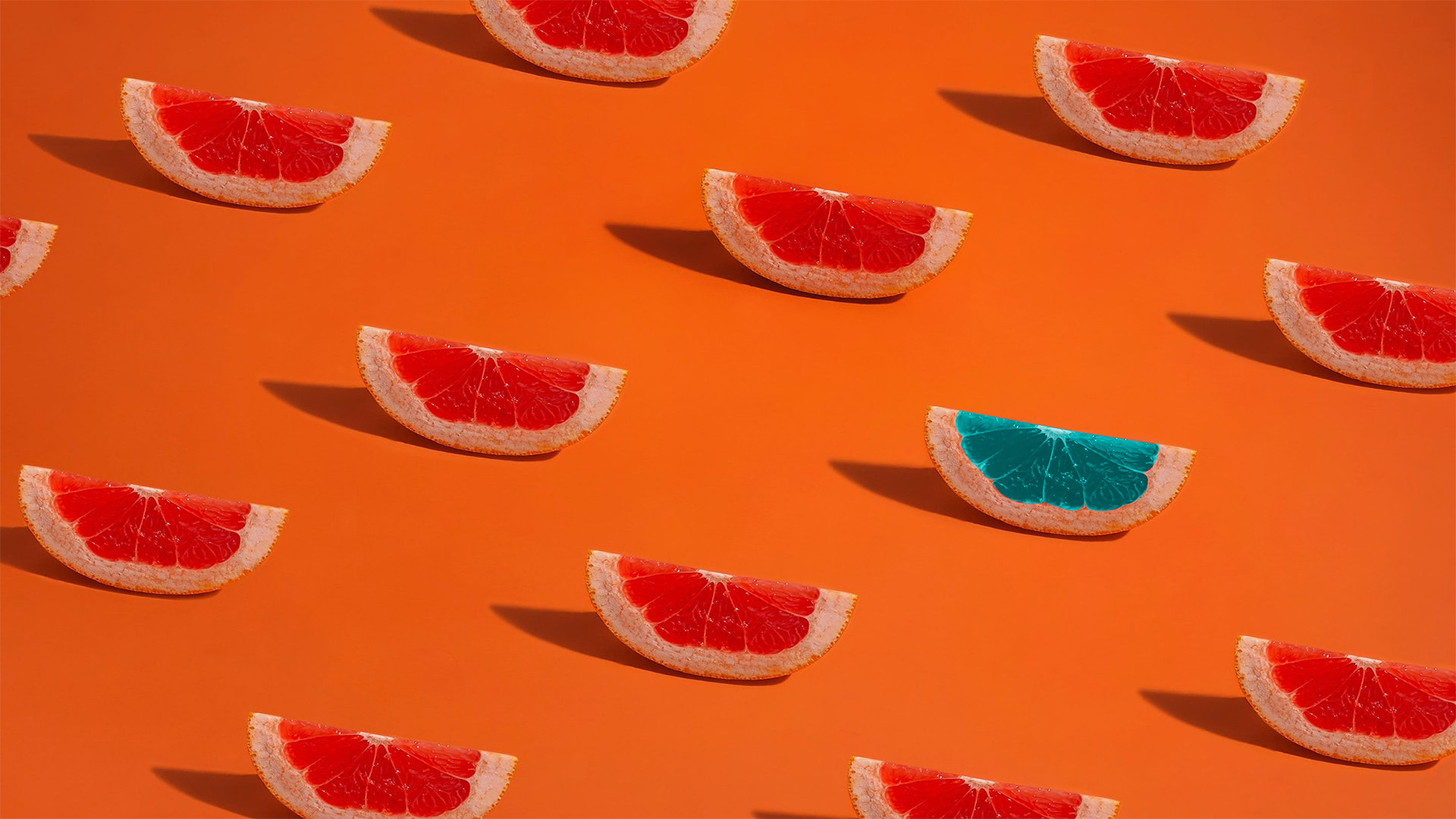
To inject relevant meaning into the D2 Studio logo, playful forward and upward moving design elements were used to translate our forward thinking culture and the growth of our portfolio. Our favicon (a small iconic image that represents your business used in browsers and bookmarks) was designed as a simple ‘coat of arms’ signifying the D2 Studio family. With regards to typography and colors we strived to create a simplistic/minimalistic yet meaningful experience conveying a message of trust to both client and user. Orange and Red represent our balance and calmness throughout on and offline touch points. When it comes to stationary, careful consideration was given to the printing quality as our brand is not only seen but also physically felt by clients. On our newly designed website all elements of our new identity come together in a visually captivating UI design.
However, as we touched upon in a previous blog post, UI and UX design heavily depend on each other for success. The UX therefore has received just as much attention and is clean and clear, efficiently guiding users to what they need to know about the services we offer in branding, web design, e-commerce solutions.
Our own rebranding has been a valuable and successful experience. More than ever we can empathize with our clients’ needs and challenges and are able to guide them to the right solutions. As a result of our own self-evaluation, D2 Studio better.
One-stop professional service for Event Management and Marketing:
Who we are
What we do
Works
Clients
Call us
D2 Studio Creative Limited


How can we help?

 HK +852 9447 1504
 info@d2studio.org